
Compare and contrast time again with three sketches looking down the same street towards the Royal Crescent, while sat under one of the five huge trees in The Circus. The first was done with ink-brush a few days ago (colour wash added at home), the second with fountain-pen about six months ago in Winter, and the last in Spring three years ago using felt-tip and gouache. I think the ink-brush needs to be darker to hold its own when given a colour wash, and it can look a bit myopically hazy, but it’s an excellent medium for quick sketches…
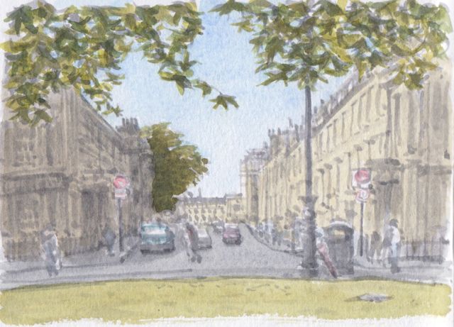
 Lexington grey ink-brush, water-colour, A6 – 20 mins ink sketch, 20 mins water-colour
 Lexington grey in fountain pen and water-brush, white gel pen, A5 – 45 mins
 1mm Pigma pen, gouache, white gel pen, Lexington grey water-brush, A5 Kraft paper – one hour


The first (coloured) looks the most realistic and the most familiar. The third is, I think, my favourite, because of those branches, and the contrast. The fourth is enhanced and arresting, and those leaves!…Something is about to happen.
You win Jim, quickest comment evah! I think the first looks like an old postcard, the third is frostily clear and detailed, and the last one looks like a comic panel but the tree at the end of the street is pleasing. I like the monochrome second one best, I enjoyed using the ink-brush to draw each leaf. Hmmm, how to combine the lightness of touch of the ink-brush, the clarity of the fountain pen, and the saturated colour of the gouache… Ed
…the endless search for the perfect medium! That gouache for the bright leaves on the last one must have been just the right thickness to fully cover the buildings behind.
I remember seeing the tree next to the one at the end of the street (and the fifth one down, I think) fall in the 1990 gales. They were slightly taller then the rest, and ended up crashing through the garden wall at the end of Brock Street.
I, too like the last one best. I think it is the way you handled the leaves, really well done. I’ve tried gouache but the way you used it made me want to try it again! What did you se for your greens?
Thanks! I have tried using Winsor and Newton gouache but found them very chalky and unpleasant to use. So I got Schmincke Horadam which are much smother. Well worth trying. With gouache I use a similar palette to my water-colours, 2 reds, 2 yellows and 2 blues. So the leaves were probably a blend of Indian Yellow and Helio Blue. Ed
Honestly, I like them all. They all have something unique about them compared to the others. I think the first is more aligned with my own impression this summer, when we hurried through this street trying to see as much as possible of Bath in a single day. Ridiculous, but now I´m smitten enough with your beautiful city to want to spend some more days there in future and do some serious sketching. Oh, and I just discovered your musical links! 😀
Thanks Viktoria, and glad you found the music. There’s a link in every post… The Jane Austen festival starts next week, so I’ll try and sketch the costumed parade. Ed