
Maru Godas’ work and the arrival of sunshine have inspired me to give gouache another chance. I’m enjoying exploring its flexible sketchy possibilities, love the physical presence that opaque colour has on the paper, and it’s speeded up some aspects of my sketching. It’s inevitably involved making a new palette (more about this in a post soon), but mostly it’s been about learning a new approach to building a picture. So here are some recent sketches using gouache, the main lessons I’ve learnt so far, and some useful links; a long post and a bit wordy, but hopefully helpful. I highly recommend giving gouache a go…

")


")


")


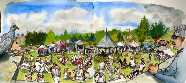
- Gouache is great for creating large pieces of urban scenery (buildings, trees) and this speeds up my sketching. I can create the middle distance/general ‘context’ for the sketch faster, allowing me to spend more time on the areas of the scene that have caught my eye. Having a single pigment green, and a premixed Bath stone colour has also helped.
- As a result I’m now partly constructing sketches from back to front; using watercolour/gouache for the sky, gouache to block in the main building/landscape forms, and adding coloured lines for detail and additional structure onto the gouache. Generally I’m painting the sky first, then while waiting for it to dry I’m using ink for the foreground detail and figures, then blocking in the buildings; back to the sky or figures, and then pencil detail on the buildings once they’re dry. This is a big change from ink drawing, when I’m generally focussed on searching out and drawing the key lines, and then adding tone or colour afterwards; … one… thing… at… a… time. Now I’m moving around the picture and media more flexibly, happy accidents occur more often, it all feels a bit looser.
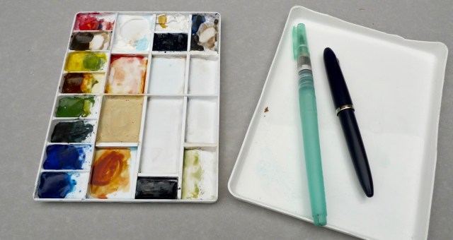
- This takes a bit more ‘orchestration’ of the various resources I’m using; I sometimes find myself with a pen clutched between my teeth, holding various pencils and a palette in one hand, and painting with the other (see picture at end of post).
- The flat, solid colour gives strong form to objects, and buildings in particular, but seems less suited for faces. A flat brush is helpful when painting buildings, and luckily there’s a flat-tipped ‘broad water brush’ from Zig, great for quick windows, doors, chimneys etc. Leaving more white space and being looser with the main blocks of colour will be my next challenge, helping the sketch to breathe a bit more.
- The potential for streakiness of gouache washes is useful for creating texture; it suits the horizontal or vertical masonry lines on buildings, and can add interest to foliage (more happy accidents).
- Watercolour is sometimes easier for some parts (the sky if working on white paper), and seems more sensitive for faces. It’s faster to apply, and easier to achieve an even wash. But combining the two, especially ‘wet on wet’, creates some great chance effects, fun for painting clouds.
- At first I was missing the clarity and definition of ink. It doesn’t go well on the painted surface (see the shadowy figures in the sketch with the bridge); it blots, lines spread, and the extra friction on the nib is unsettling. The 8B Mars Lumograph Black pencil is wonderfully dark, but the crispness of an inky line is something else. So I’m having to draw the ink work separately. But fortunately…
- …coloured pencils work beautifully on the dried gouache surface, it has a lovely subtle ‘tooth’. The slight friction from the paint draws the pigment from the pencil. I’m using Derwent Coloursoft pencils, the colours chosen to complement the gouache. The line work is softer than pen/ink, so settles further back into the sketch, adding depth. It wonderful for quickly adding detail and definition to the buildings/foliage blocked in in gouache.
- Having a strong white mark-maker is important, one that’s able to stand out against/alongside the strong presence of gouache colours. I’ve tried lots, and the best pen I’ve found is the Uni Correction Pen Plus CLP-305. Unlike many others it has a rollerball tip, not a metal retractable nib, so is much smoother on the paper. It also has a pressure release system, by squeezing the barrel you can regulate the flow of ink, and the ink dries very fast. The best white pencil I’ve found is the Staedtler Lumocolor Permanent; it has the strongest pigment, sharpens to a reasonable point and goes well onto gouache.
- You don’t need to use gouache for opaque water-soluble paint; for green, red and yellow I can use opaque watercolours. And good quality gouache will dilute down to an almost translucent wash, so a palette combining both is very flexible. (More on this in my forthcoming post on palettes…)
- Warm sunny weather suits the saturated colours, but also helps the paint to dry. It does dry fairly fast, but I can see why it’s popular with sketchers in warmer countries! This short waiting time is a good opportunity for observing the scene.
- Gouache has some particular quirks; the darks tend to dry lighter, and the light colours tend to dry darker; but not always. Practise and familiarity will help me learn its characteristics.
- The different brands are very different in feel, so try out a few to make sure it’s not the brand and their formulation that’s putting you off gouache. The muddy chalkiness of W+N ‘Designers Gouache’ put me off gouache for a long time; then I tried Schmincke Horadam, lovely stuff.
- There is a wonderful liberation in being able to just add a colour when wanted after the care needed and irreversible and unforgiving nature of watercolour. But some colour restraint is needed. It’s so easy to add every colour you can see, but this can make the sketch a bit hard on the eyes; a limited palette would be ideal, but I don’t have the discipline. (It also makes it reminiscent of children’s book illustrations, but I like this effect…)
- Premixing a frequently used colour is handy, saving time and all the water needed for mixing on the palette. Most of the building’s around here are made of Bath stone, so for my current palette I’ve premixed a ‘convenience colour’ that works well for this (Titanium Gold Ochre, with Titanium White and a touch of Cadmium Yellow and Raw Umber).
- You need lots more water, to clean the brush between colours. As I use water-brushes I just bring three along, you can swap the reservoirs. One detailer for finer gouache work (rare), one large (general work and watercolour washes), and the ‘broad’ with the flat brush tip. A spritzer spray not only helps ‘wake up’ the paints when you start a sketch, it’s also good for cleaning the palette and preparing larger areas of paper for a wash, or ‘wet on wet’ work.
- Tinted paper is a great foil for the saturated colour. Following recommendations from Pat Southern Pearce and others I’m using Strathmore 400 paper (bought in loose sheets and bound into books alongside Saunders and Waterford HP 190gms High White paper).
- You also need a bigger palette for the colour mixing, but you don’t need to be as careful about mixing colours on top of each other. Gouache seems much less fussy than transparent watercolours about adulteration, but the titanium white does take a while to clean out. Here’s my new palette:
And here are the colours I’m using; various brands, a mix of gouache and watercolour, opaque and translucent, and mostly single pigment:
")

- That’s plenty, but after writing all the above I then found this post on James Gurney’s blog, which has much fine advice from a very experienced gouache user. One key difference is that he’s using paint from the tubes, which I want to avoid for general portability and simplicity; I find the dried Schmincke gouache rewets well. I think keeping the paper size, or at least the gouache sections, smaller is the key here. And keeping the palette ‘spritzed’ with water when painting to keep the paints fresh and useable.
- Ron Stendhal has also written extensively about gouache; here’s her ‘gouache compendium’ page with much excellent information. Here she compares watercolour and gouache. And here’s an article she wrote generally enthusing about gouache.
- Here’s Maru Godas’ workshop notes from Chicago.
- Here’s urban sketcher Heather Martin recommending gouache.
- Nathan Fowkes gouache sketches are lovely. Here’s his kit.
- Here and here are some more general ‘gouache top-tips’ pages I’ve found.
- And here’s how I feel when switching between pens, brushes etc…

(Philippe Halsman, ‘Jean Cocteau (Multiple hands)’, 1950)


I thought Gouache might give a duller finish but your pictures are as bright and vibrant as ever. NIce work 😉
Thanks, it suits sunny weather!
You like your blue, don’t you, Ed 🙂
My favourite colour, so I enjoy it when the weather suits!
It’s very interesting seeing your progress with gouache! Thanks for your summary of things learned and useful tips. I’ll probably give gouache a shot at some point!
– Tina
Thanks, let me know how you get on if you do…
Thanks for all the great links. I love your gouache sketches
I’ve just started working with gouache and know next to nothing about it – and so this post is just what I needed! THANK YOU!
Glad to hear it’s helpful, enjoy exploring opacity!
Pingback: Landscapes at 80mph | Mostly drawing