
A couple of attempts to simulate depth of field by using pen for the foreground and ink-brush (and lighter ink) for the background. A partial success? I think the first one’s more effective, partly because the key subject (the mug) is closer to the viewer. I’ll try it in the outdoors next…
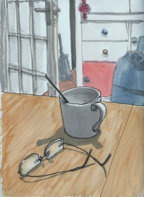
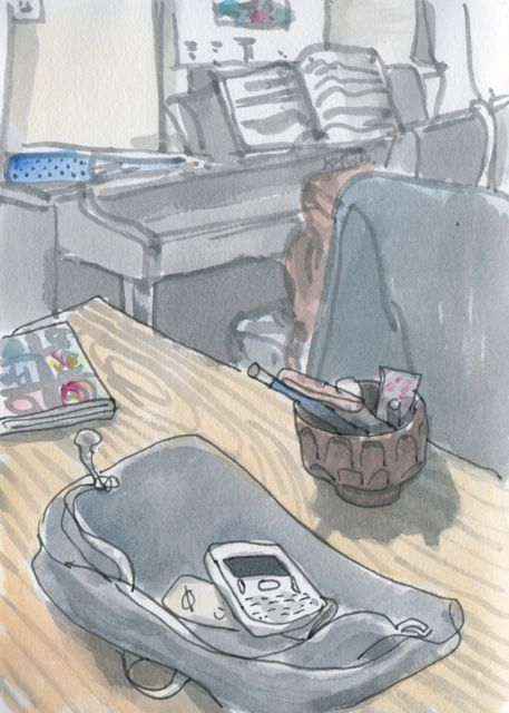 Lexington grey in fountain pen, Kuretake #40 ink-brush, and water-brush, water-colour, A5 – 30 mins each


I think it works. Particularly in the first one. Perhaps because the distance between fore- and background is more pronounced.
Thanks Viktoria. I think you’re right, the effect is heightened. Ed
I like your technique here! I try to do the same with colored pencils lightly applied in the background.
– Tina
Thanks Tina. I guess this is similar to the ‘warm/cool’ tones of grey that Don Colley was showing you? (Very jealous of you getting to his workshop. I think your resulting Lockheed is excellent, beautifully curved!) Ed
Hi, Ed! It’s great to see you “struggling” like us mere mortals 🙂 Do you think, there may still be too much detail in the background? The coloured knobs, the music notes? They could be battling for the onlookers attention. This could be intentional, though … the music of the light attracting our attention. BTW: the lines of the red draw and the brown floor in the background seem to be tricking me into believing the drawer is part of the floor … it’s like a tangential effect. Lovely light effect. I need to go back to watercolours soon.
Thanks, it’s the struggle that makes it all endlessly fascinating? So many approaches, views, materials etc… and all with challenges. I like a bit of detail in the background so I can look beyond; I find heavy depth of field in photos a bit coercive, you can only really see what the photographer’s got in focus! And I hadn’t spotted the floor/cupboard effect, pure coincidence. Ed