
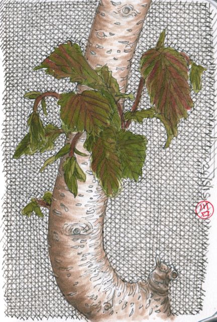
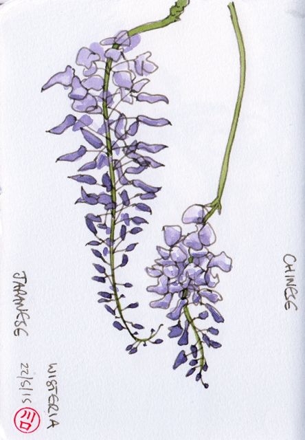
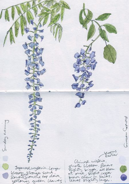
More botanical sketching, this time in our back garden. First some new leaves sprouting from a shiny hazel trunk, then Japanese and Chinese wisteria flowers compared. The final sketch is a similar wisteria comparison study, but was done when I’d just started sketching four years ago and was using extra-extra-fine nibbed fountain pens with black ink. When I compare the two pictures the main changes are speed (due to daily practise, but also better materials), a greater appreciation of the importance of curves, and the development of a more confident line (helped by using thicker nibs). Remind me and I’ll do another comparison in 2019!
 Fountain pen and water brush with dilute Lexington grey and Brown 41 blend, watercolour, A5 – 50 mins
 Fountain pen with Lexington grey/Brown 41 blend, watercolour, A5 – 30 mins
 Fountain pen with Carbon ink and watercolour, A6 – a fair while


Great sketches, Ed. I like the way the birch trunk pops off the background. And the latest wisteria sketch shows how a bold, confident line can bring all the subtle curves and details to the front. It feels more solid and sure yet full of life. See you in 2019!
…oops, I meant hazel, not birch.
Thanks Jim. I can’t remember why I started all the cross-hatching, but it created some good contrast. See you soonish… Ed
Wonderful. Kew-worthy. Not your average 5 min sketch!
Thanks John, I think I should pop down the road to the Vicky Park Botanical Garden, some lovely stuff there. But Kew would be a real treat! Ed
The difference between the two wisteria drawings is subtle but dramatic, your latest drawing is very eloquent! How did you get the tree to look rounded? Great sketches!
Many thanks Cathy, it took me a while to work out the difference, as the earlier one has all the ‘right’ bits of the plant there, it’s just the expression of the lines that’s changed? ‘Eloquent’ is a lovely description! I rounded the tree by following the curvature of the trunk in all the ink-brush stokes, and darkening the outer edges. The contrast with the cross-hatching makes it stand out too. Ed