
June 2017: Here’s an update re the addition of some opaque watercolours and a couple of others to the original palette described further below:
For sketching on tinted papers I want to include a few opaque watercolours, including white. These are much smoother and easier to use than any gouache that I’ve tried, and mix beautifully with my usual six translucent paints (see further below)

I’ve also got used to using a couple of extra pigments: Perylene Green for rich and deep foliage, and Payne’s Grey for meltingly smooth shadows. So the full palette (minus the opaques above) is this:

All set up on my portable palette (instructions on how to make one of these are here) it looks like this:

(And here’s the original paint post from a few years ago…)
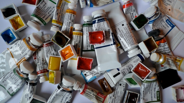
These are some of the tubes and pans of paint that I rarely use any more. As they cost about £5 per item, choosing the right paints can be the most expensive part of this past-time. I try to keep my sketching kit portable and simple, and over time this has led to a gradual reduction in the number of paints on my palette.
I started with a palette of many colours; a mixture of translucent and opaque, and pure pigments and ‘convenience colours’ (ones made up of several pigments). I chose colours I liked, and ones I thought would be useful. This wide range of colours made it hard to learn which ones mixed with which in what way, and made me reliant on using the pre-mixed colours when sketching, rarely mixing to create the colour in front of me.
Gradually through use I found that I preferred the effect of translucent colours, watching with dismay as a tiny patch of titanium white muddied my palette and picture…
Reading Russ Stutler’s article on choosing colours led me to the fabulously comprehensive Handprint website and an initially overwhelming amount of information on the subject of pigments and paints. Through using this resource I settled on a smaller set of 12 pure pigments, all lightfast and mostly translucent (I kept lamp black and titanium white for a while). I made palettes to hold them and over time have reduced them further.
I’ve since spent many happy hours mixing and blending paints to see which ones I could discard, without limiting the range of colours I could paint; (for example black is now replaced by a mix of raw umber and french ultramarine).
So my current palette is down to six colours: Raw Umber, Quinacridone Gold, Hansa Yellow Medium (these 3 made by Daniel Smith), and French Ultramarine, Winsor Blue (Green Shade), Permanent Rose (these 3 made by Winsor and Newton). It’s a version of the classic ‘warm/cold’ palette, with 2 reds, 2 yellows and 2 blues. This is the type of palette recommended by lots of painters, but it was interesting learning for myself that less is more.
(I’ve also moved from buying half-pans of solid paint to large tubes of the 6 chosen paints. They’re more flexible for filling home-made and different sized palettes, and should save money over time.)

Here’s an attempt to see how these colours blend in various combinations of three:

I recommend getting some large sheets of watercolour paper and slowly blending a range of colours. Have fun exploring the vast world of paint and discovering your own personal palette…


Pingback: Ink brushes | Mostly drawing
Pingback: Spring gouache | Mostly drawing
Hi, great drawings and really like your use of color! Would you tell me why you choose the paints you did so I can learn more about color choices? I am trying to learn how to mix my paints to get the colors I need. I am curious too about your choice of raw umber? Thanks!
Hi Cathy, thanks for the kind comments. My 6 colour palette reflects my love of translucency (works great with inks, and good for multiple ‘glazes’ or layers) and commitment to single pigment paints (each paint has only one pigment in it, so minimising the ‘muddy’ colours you can get when mixing in the palette when lots of pigments start to blend). I know the 6 paints really well (how they behave, how they mix etc.) as there are so few of them! Raw Umber looks a bit dull, but it’s key to many colour mixes, and it combines brilliantly with French Ultramarine to make excellent blacks and neutral greys. As it can be an expensive business buying paints to try I recommend starting with just a few and seeing just how many colours you can achieve from them; I think six is plenty. Ed
Thank you for a glimpse into how you choose your paints. I have gone through so many colors and I am finding that I really want fewer colors, it’s just confusing with too many and it takes away from my enjoyment of drawing!
This is really interesting. I have experimented much with paint over the course of the winter, and this summer I find myself – without really having thought it out, just by instinctually bringing along what works – with six colours in my kit also: hansa yellow, yellow ochre, paris blue, indigo, magenta, and english red. Two yellows, two blues, and two reds. Totally works. Amazing.
Excellent! I find I mix colours more accurately with less pigments, and that I know how they all interact as there are less variables. Less is more. Ed
Pingback: Muji pocket palette | Mostly drawing
Pingback: ‘Things to make and do’ | Mostly drawing
Hi Ed, just a quick pigment question. Will you stil use Daniel Smith’s Quin Gold now that they’ve changed their formulation? Thanks!
Hi Cathy, not sure. Jane Blundell has a post on various Quin Golds, says she thinks the new one’s OK, but it is a dual pigment. I’ve (hopefully) just bought what look like the last couple of tubes of the original from an art shop in Australia (!), and will eak it out as long as I can. We were all warned about this 17 years ago, so shouldn’t be surprised!
Thanks Ed!